Color is one of the most powerful tools in interior design. It can evoke emotions, create an atmosphere, and even affect our moods. Color can have a significant impact on the overall look and feel of a space. When selecting a color palette for your home, it's essential to consider the mood you want to create. Different colors have different psychological effects on people. For example, warm colors like red, orange, and yellow can create a sense of energy and excitement, while cool colors like blue and green can create a calming and relaxing atmosphere. Choosing the right color palette for your home can be a daunting task, but with a little guidance, you can create a space that's both beautiful and functional.
Consider the mood you want to create
Before you select colors, think about the mood you want to create in each room. Do you want a warm and cozy atmosphere or a light and airy feel? Do you want to create a sense of calm or energize the space? Once you clearly understand the mood you want to create, you can select colors that will support that goal.
Once you know the mood you want to create, you can choose a dominant color for the room. This color will be the primary color used in the space and will set the tone for the rest of the colors. For example, if you want to create a cozy and welcoming atmosphere in your living room, you might choose a warm, earthy color like terracotta or deep brown.
Choose a dominant color
When selecting a color palette, start with a dominant color. This color will be the most prominent in the room and will set the tone for the entire space. Consider the mood you want to create and choose a color that will support that goal. For example, if you want to create a calm and relaxing space, choose a soft blue or green.
Select accent colors
Once you have selected a dominant color, you can choose accent colors to complement it. Accent colors are typically used in smaller doses, such as in accessories, accent walls, pillows, curtains, or artwork. They can add interest and depth to the space and can create a cohesive look throughout the room.
When selecting accent colors, consider colors that are complementary or analogous to the dominant color.
Consider the lighting
Keep in mind that the lighting in your home can affect how colors appear. Natural light can make colors appear brighter and more vibrant, while artificial light can make colors appear duller or more yellow. Consider the lighting in each room and how it will affect the colors you choose. It's a good idea to test your colors in the space to see how they will look in different lighting conditions.
Let’s have a look at common traits associated with some exciting colors and their effect when used to create a modern and colorful space.
- White
Atmosphere: White is a complete reflection. It signifies purity, innocence, and clarity. White space can get more natural light in the space and make the space appear bigger. It’s also a blank pallet on which you can add different accents to express yourself.
- Yellow
Atmosphere: Cheerful and bright, yellow is often considered the happiest of colors. It's the color of trust and hope, and it helps you concentrate. Self-esteem, extroversion and emotional strength are all associated with this color.
- Orange
Atmosphere: Orange creates an excited or inspiring atmosphere that demands attention without being overbearing. Orange is an inviting and friendly color that isn’t “too” in-your-face.
- Green
Atmosphere: In color psychology, green is a very optimistic color because it encourages thoughts of balance, growth, and restoration. It immediately conjures up images of the natural world, and it's a fantastic way to bring a breath of fresh air into your interior space, especially if you are in a city with minimal greenery.
- Blue
Atmosphere: Calm seems to be the right descriptive here. Deep, bold colors like navy and royal blue inspire confidence and are associated with positive traits like loyalty, trust, peace, and success.
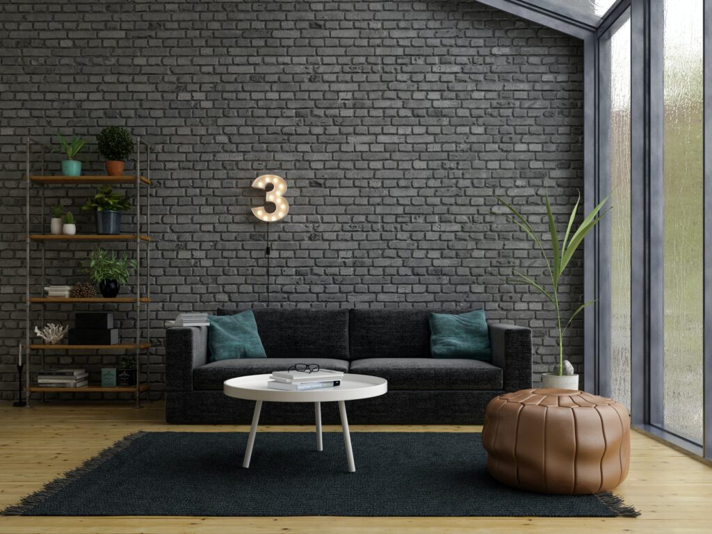
- Gray
Atmosphere: Serene and refined, gray can create a shadowy, neutral and calm feeling. Light grays are a great substitute for white, and dark grays are great as an alternative to black. Despite being perceived as traditional or conservative, gray can be fun and modern too.
- Purple
Atmosphere: Purple is the color of luxury, royalty, and spirituality. Derived from blue and red, it is a very rich color that seems to combine the qualities of blue’s comfort and red’s appetite stimulant. Used in its true form, it is very strong and prominent, but lighter lilac shades are very comforting colors. Purple is also a more creative color than it is intellectual.
- Pink
Atmosphere: Pink is a nurturing, playful, and nostalgic color that takes people back to their childhoods and it can make us think of both innocence and burning passion. Bright and hot pinks are associated with love and romance.
- Black
Atmosphere: Black is probably the strongest of all colors and can imitate very extreme emotions. Black is the color of mystery, boldness, and confidence. As with most colors, because emotions are so subjective, there are positive and negative associations with this color.
Before committing to a color palette, test your colors in the space. Don’t forget to test colors at different times of day to see how they will look in different lighting conditions.
Choosing the perfect color palette for your home can be a challenging task, but by considering the mood you want to create, selecting a dominant color, choosing accent colors and considering the lighting, you can create a space that's both beautiful and functional. Remember, color is a powerful tool in interior design, so choose your colors wisely and enjoy the transformation of your space.